Routinizing the UI
Interacting with graphical user interfaces (GUIs) sometimes feels conversational and sometimes not. A dialogue box that asks a yes-no question feels much the same as a verbal yes-no question. And a blog post can feel very un-conversational in the sense of a lecture or commentary.
When we speak our own language about everyday matters, we speak effortlessly with little thought to how to produce an utterance and little thought to how to understand one spoken to us. It’s a bit different with written language. We endure years of school learning to read and write following style and rhetorical guidelines which we memorize and practice endlessly until we know how to recognize and avoid passive constructions - as well as generate them with practiced ease. Reading and writing text is just not as intuitive as speaking conversationally and most people require years of practice to achieve any competency.
When GUIs sprang into public view in the 70s and 80s, it because possible for people to interact with a computer without having to learn seemingly arbitrary complex commands typed into a terminal window. GUIs made sense. You could point and push buttons. An icon was a symbol that stood for something meaningful like a “program”. And there was plain old English language mixed in with icons and graphics (since GUIs originated in the United States). GUIs felt natural.
During all of the hype of GUI-based interfaces, software developers learned to adopt the notion of software patterns. The idea was to document shared knowledge of best practice of how to solve common or typical problems in software design. Software patterns is a fantastic concept for anyone learning to write software. Writing software and designing UIs has much in common with learning how to read and write text. It requires a lot of practice before you become any good at it. Software design patterns help new programmers speed up the process so they don’t have to figure out how to solve every problem encountered through brute trial-and-error.When desktop computers became really popular - and web interaction more so in the 2000s, some software engineers began to specialize in “front-end” development. Anyone dabbling with web interaction might consult the Yahoo UI design pattern library while developing a new web application. In fact, Yahoo’s purpose for its design pattern library was to solve a business problem. They wanted a way to communicate standards across development teams in order to increase "consistency, predictably, and usability" across their site - and their brand.
Human Computer Interface (HCI) guidelines capture specific problems, examples, usage, rationales, and supporting research, standards, etc. Patterns range across stylistic conventions (e.g., page headers and footers), attentional mechanisms such as animation, navigation and organization, layout, common functions such as registration or login, and even more complex patterns such as social sharing and feedback.
In addition to useful, everyday patterns, the notion of anti-patterns and dark patterns document practice in common use which may be ineffective (anti-patterns) or ethically questionable (dark patterns) patterns.
It turns out that when we learn language, some concepts and patterns become entrenched with frequent use. So, for example, the phrase “I don’t know” is not something most of us have to think about before uttering. The grammatical construction I (subject) + do (1st person aux verb) + negation + know (infinitive) is not something you have to think about assembling before you say it. Such forms become routinized through repeated activation and use - such that both production and understanding require less cognitive effort and is more automated.
This sort of automatization is not limited to conversational speech. Routinization happens at many levels of production and understanding. For example, when you see a familiar word like “key”, pronunciation is automatic. It also interacts with syntactic chunks such that when someone says, “cat in the ___", you anticipate “hat”.

Routinization isn’t limited to long-term memory. Suppose you are having a conversation with a friend. You are talking about a movie of which neither of you can remember the name. So you say, “that movie with Harrison Ford”. It would not be surprising if your friend then referred to the same movie as, “the Harrison Ford movie”. You can routinize a reference to something during the course of an interaction in order to communicate more easily.
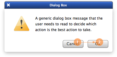
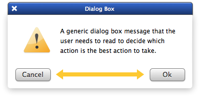
Priming is applicable to GUI patterns. When the GUI presents a dialog box like the one below, it is familiar. It offers a choice (1) or (2). Typically, the choice is binary - cancel or accept; yes or no; permit or deny, etc. You read the text and make a choice.
So lets talk about the difference between interaction design patterns and linguistic patterns. Well one obvious difference is while we use language all day long, only a few of us know how to produce UIs. And when people interact with UIs, they aren’t interacting directly with the designer. So the designer doesn’t get direct (or continuous) feedback on how well the user understands the interaction. Production is not directly linked to comprehension in a realtime feedback loop like face-to-face dialog; it is a bit more like interacting with monologue text. This means that patterns are not aligned and refined in the same way.
Interaction design patterns help improve communication, but because they are easily modified by the designer with no direct feedback about how such changes affect a user’s comprehension – there is propensity for non-obvious error.
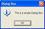
In fact, there might be a lot of information packed into a dialog box. Dialog boxes don’t have to be simple binary choices. The UI designer can make a dialog box for any purpose. Here’s a very simple one where explicit choice is omitted. I guess I can say “not okay” by clicking the “x”. Maybe. Hmmm.
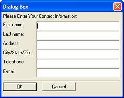
Here’s a complex dialog that combines the basic cancel, accept pattern with other buttons and choices. From experience, I expect that I can do a bunch of things and then choose “OK” or “Cancel” when I’m done. But it requires a bit more thought on my part – and also a bit of trust where if I spend a lot of time on this and then mess something up, I don’t know what will happen.
Here’s a dialog box where I worry that if I click on the hyperlink that I don’t know if I’m still in this dialog or I’m sent off on a wild goose chase.

Below, is it more confusing if I move the “cancel” button like this? Will the user even see the “cancel” button? Will they become confused because the design conflicts with expectation?
Considering the examples above, it’s easy for UI and software designers to break the simplicity of such a simple design pattern by:
- packaging the information differently (adding more to a screen or component, for example)
- altering labels so that our expectations are jarred
- altering the position of a component so it is not in a familiar position
- creating a semantic mis-match between text and button labels (if you don’t understand the text what the heck do you do?)
- dispersing choice across form buttons, images, and text (e.g., embedded hyperlinks in text)
Common design patterns are easily broken. Any designer or developer with a text editor can so it easily without understanding the impact on comprehension. Producing comprehensible GUIs requires as much practice as writing clear, well-structured text. Design patterns arguably serve as a cognitive aid boosting mechanisms supporting routinization and automatization of understanding. But as designers we need to be very sensitive to the effect of alteration, no matter how benign the change might seem. Clearly, we learn such sensitivity writing prose. Why not user interaction?
Lisa D. Harper
Researcher in Human Computer Interaction
I study how people interact with technology and how technology affects behavior